
1. Arcadia - Arcade Station
This suprised me that it worked well. I was worried about the building design that it wasn't going to work well with the whole "funfair" idea, but I was wrong. I really like this, though now... I could prehaps do it greater than before. The inside details are fantastic, shame you don't get to see into it further; I didn't achieve the full arcade as I had planned but I managed to get something worthy. The worst part was lighting the word "Arcadia", as I had to remove the glow texture to make sure the lighting showed. It's not perfect but it works, though I really like the lighting inside. This was also the first time I used the shadows.

2. Dr Green's Bottle Clashers.
It's ok. That's pretty much the short of it. I managed to add a cloth underneath the bottles but the rest is average... not too attraction but not too unimpressed. For the texture scheme I was hoping it be brighter but I just couldn't imagine paint being showed like that in our realism idea.

3. The Wooden Bin.
This our "where's Wally?"

4. The Portable Toilet
I liked the model, I didn't mind the texturing... but the lighting...
Every model (except the hammer) receives a purple lighting resulting from the moonlight or the impact from the Neon glows from the funfair rides. It's fine for this model but I wanted a replacement, another way of showing it... which I just couldn't create for this model.

5. Voltbox - Gate Power
As originally shown on the day I couldn't make it, this is the power to the whole funfair and the enterance to the gate. The original idea was a to have a pull-switch inspired by the "Frankenstein's Monster creation" classic reference, but it just couldn't be seen from Michael's animatic distance. So a replacement red/gree light boolean was used to present the activation instead, and is counted as a worthy replacement. Originally Leonard was set out to design this model but after "fallsbacks" I had to step in. It's a passable model and a improvement on the first models designed for this course, but there's a limit on what you can do with a box.
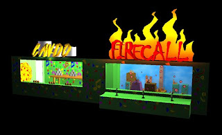

6. Minigames. Can-do and Firecall.
This as mentioned was one of my own ideas, two activity games set for the funfair. The "firecall" sign worked better than planned, using coloured lighting to show the Neon lighting in the flame. It's a shame you can't see the targets as clearly in the full animatic but at least you can tell what the game is, which was the whole point and purpose of this featured building. The weakness with this one, to me, is the "can-do" title, in which due to the model design that it is too difficult to read no matter what texture I slab at it. That was due to my fault, but strangly enough I didn't have problems reading it when making...
I guess the texture of the building could also be a weakness, but after all the designs and colour testing to gtet it right, I think this is best I can do for this structure.
I'm pleased, how about you?
No comments:
Post a Comment