GOOD JOB guys, we get it done.!!!
Although I think the lighting is terrible, that is my fault really. If we can do this again, I would render all machines in one scene and spend more time to do the light's animation in Maya. But ...yeah, I believe all of us have learned a lot from this project. Both in technical and non-technical..really, i mean, we have not only been working on ''Mayaaaa' but also teamworking, communication and most importantly, friendship. For me, a true learning process is more important than the result we get. I call this a success, no matter what grade we get from the actual thing.
And...back to the work itself, I think we planed everything alright except from the post-production stage. We should leave 2 weeks for rendering and compositing instead of 1. That's all.
Cheers!
Sunday, 14 December 2008
Thursday, 11 December 2008

Render Settings of Glory!
Here are my settings. I noticed that you use a couple of different outcomes, but none of it disrupting our final viewings... so it doesn't really matter. Just for your infomation:

Any comments or questions feel free to ask, we've discussed about this before.

Any comments or questions feel free to ask, we've discussed about this before.
My Light! My Light!
Hay team. Here are the final Lighted and and rendered-test models that I have created. It turned out a lot better than expected and I have a bit more inspiration for this project. The hammer is not featured due to problems about light making the model darker, but the Moonlight Ambience Light should cover that when we come to the end. Enjoy!
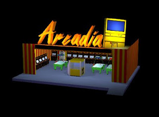
1. Arcadia - Arcade Station
This suprised me that it worked well. I was worried about the building design that it wasn't going to work well with the whole "funfair" idea, but I was wrong. I really like this, though now... I could prehaps do it greater than before. The inside details are fantastic, shame you don't get to see into it further; I didn't achieve the full arcade as I had planned but I managed to get something worthy. The worst part was lighting the word "Arcadia", as I had to remove the glow texture to make sure the lighting showed. It's not perfect but it works, though I really like the lighting inside. This was also the first time I used the shadows.
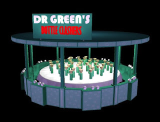
2. Dr Green's Bottle Clashers.
It's ok. That's pretty much the short of it. I managed to add a cloth underneath the bottles but the rest is average... not too attraction but not too unimpressed. For the texture scheme I was hoping it be brighter but I just couldn't imagine paint being showed like that in our realism idea.

3. The Wooden Bin.
This our "where's Wally?"
4. The Portable Toilet
I liked the model, I didn't mind the texturing... but the lighting...
Every model (except the hammer) receives a purple lighting resulting from the moonlight or the impact from the Neon glows from the funfair rides. It's fine for this model but I wanted a replacement, another way of showing it... which I just couldn't create for this model.
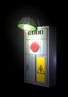
5. Voltbox - Gate Power

1. Arcadia - Arcade Station
This suprised me that it worked well. I was worried about the building design that it wasn't going to work well with the whole "funfair" idea, but I was wrong. I really like this, though now... I could prehaps do it greater than before. The inside details are fantastic, shame you don't get to see into it further; I didn't achieve the full arcade as I had planned but I managed to get something worthy. The worst part was lighting the word "Arcadia", as I had to remove the glow texture to make sure the lighting showed. It's not perfect but it works, though I really like the lighting inside. This was also the first time I used the shadows.

2. Dr Green's Bottle Clashers.
It's ok. That's pretty much the short of it. I managed to add a cloth underneath the bottles but the rest is average... not too attraction but not too unimpressed. For the texture scheme I was hoping it be brighter but I just couldn't imagine paint being showed like that in our realism idea.

3. The Wooden Bin.
This our "where's Wally?"

4. The Portable Toilet
I liked the model, I didn't mind the texturing... but the lighting...
Every model (except the hammer) receives a purple lighting resulting from the moonlight or the impact from the Neon glows from the funfair rides. It's fine for this model but I wanted a replacement, another way of showing it... which I just couldn't create for this model.

5. Voltbox - Gate Power
As originally shown on the day I couldn't make it, this is the power to the whole funfair and the enterance to the gate. The original idea was a to have a pull-switch inspired by the "Frankenstein's Monster creation" classic reference, but it just couldn't be seen from Michael's animatic distance. So a replacement red/gree light boolean was used to present the activation instead, and is counted as a worthy replacement. Originally Leonard was set out to design this model but after "fallsbacks" I had to step in. It's a passable model and a improvement on the first models designed for this course, but there's a limit on what you can do with a box.
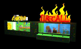

6. Minigames. Can-do and Firecall.
This as mentioned was one of my own ideas, two activity games set for the funfair. The "firecall" sign worked better than planned, using coloured lighting to show the Neon lighting in the flame. It's a shame you can't see the targets as clearly in the full animatic but at least you can tell what the game is, which was the whole point and purpose of this featured building. The weakness with this one, to me, is the "can-do" title, in which due to the model design that it is too difficult to read no matter what texture I slab at it. That was due to my fault, but strangly enough I didn't have problems reading it when making...
I guess the texture of the building could also be a weakness, but after all the designs and colour testing to gtet it right, I think this is best I can do for this structure.
I'm pleased, how about you?
Bump In, Bump Out.
Ok I just wanted to show you lot Michael's Texture trick, it's an effective method of standing our the work you want to show. This is more of directed to Leonard since me and Michael both know, but this can easily be used as a reminder or workings.


OK then:
First we find the texture in question.

Then we access the bump mapping settings, and set as a the same file as the texture.


Then we increase or decrease the /text/data. So it makes the texture futher in or out to create depth. This is the final example:


Simple enough, but effective. Thank you Michael, you needed to show me something new after the Ncloth.
Oh and since things are going well, this shall be our final cake:

Good times.
Wednesday, 10 December 2008
Tuesday, 9 December 2008
Tomorrow I'll
We meet up tomorrow, we should get everything together and start the After Effects work. I'm currently doing the render tests, I don't know if they work but we shall see tomorrow...
Subscribe to:
Posts (Atom)